Our Summer Sale has arrived - Up to 60% off | Free UK Shipping on Orders Over £400
Christmas Dining Inspiration
Inspiration
Christmas Dining Inspiration
4th November 2021

Getting a head start on your Christmas table planning is definitely a smart move so we’ve compiled Birdie’s answers to four of your most asked questions on festive table planning. So read on and save yourself at least a little bit of Christmas stress!


1. I really want to impress my guests but where do I start?

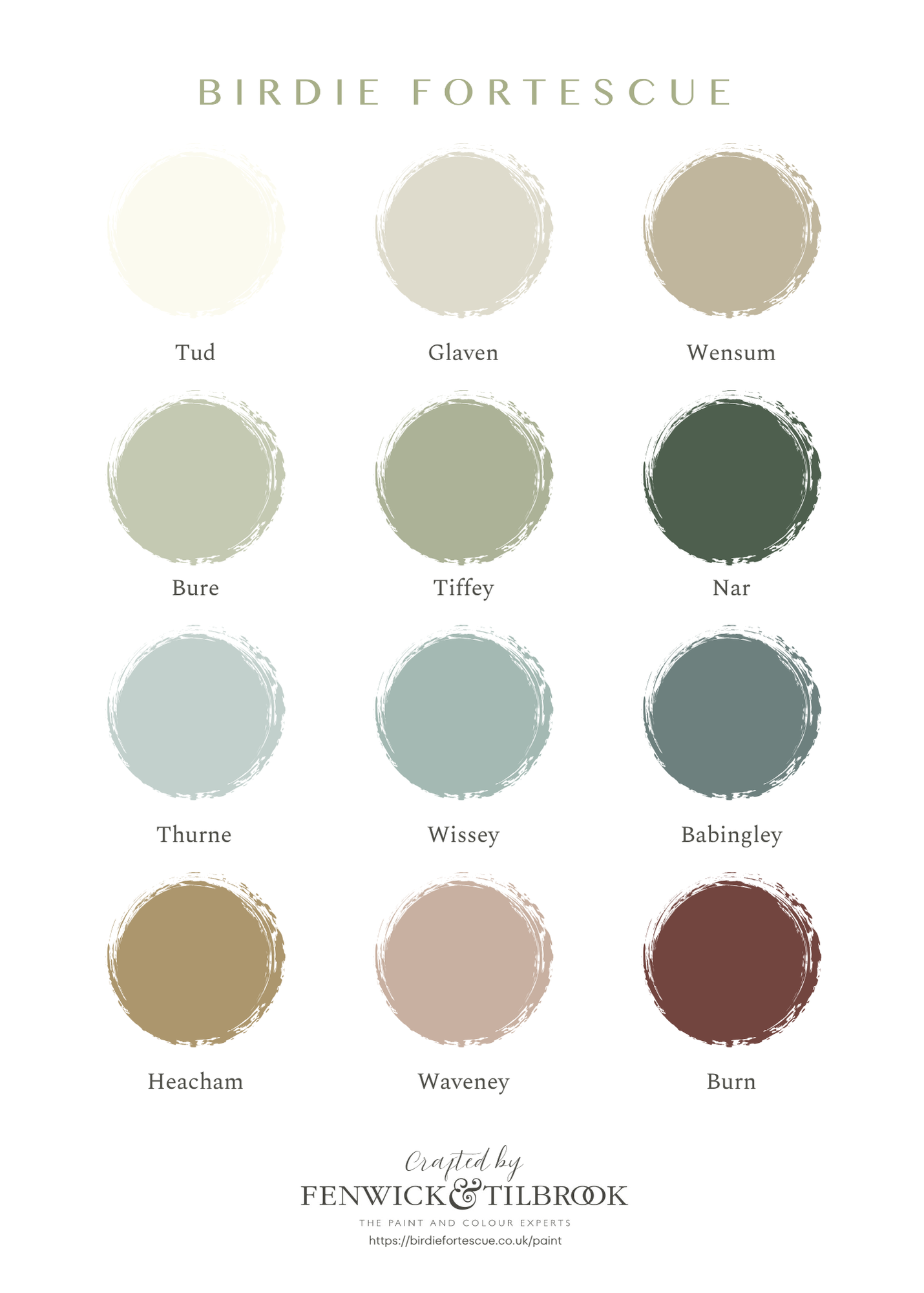
The most amazing tables are usually the best planned. Decide on a colour scheme and choose something to base your look on. This could be a beautiful tablecloth like our Ilex cloth, an antique centrepiece or a lovely runner you’re planning on making from seasonal foliage. Once you’ve got this basic framework sorted you can start fleshing things out by adding extra linens, crockery, glassware and decorations.

2. I’ve got lovely antique table linens to use but they’re plain white, how can I make them look a bit more interesting?

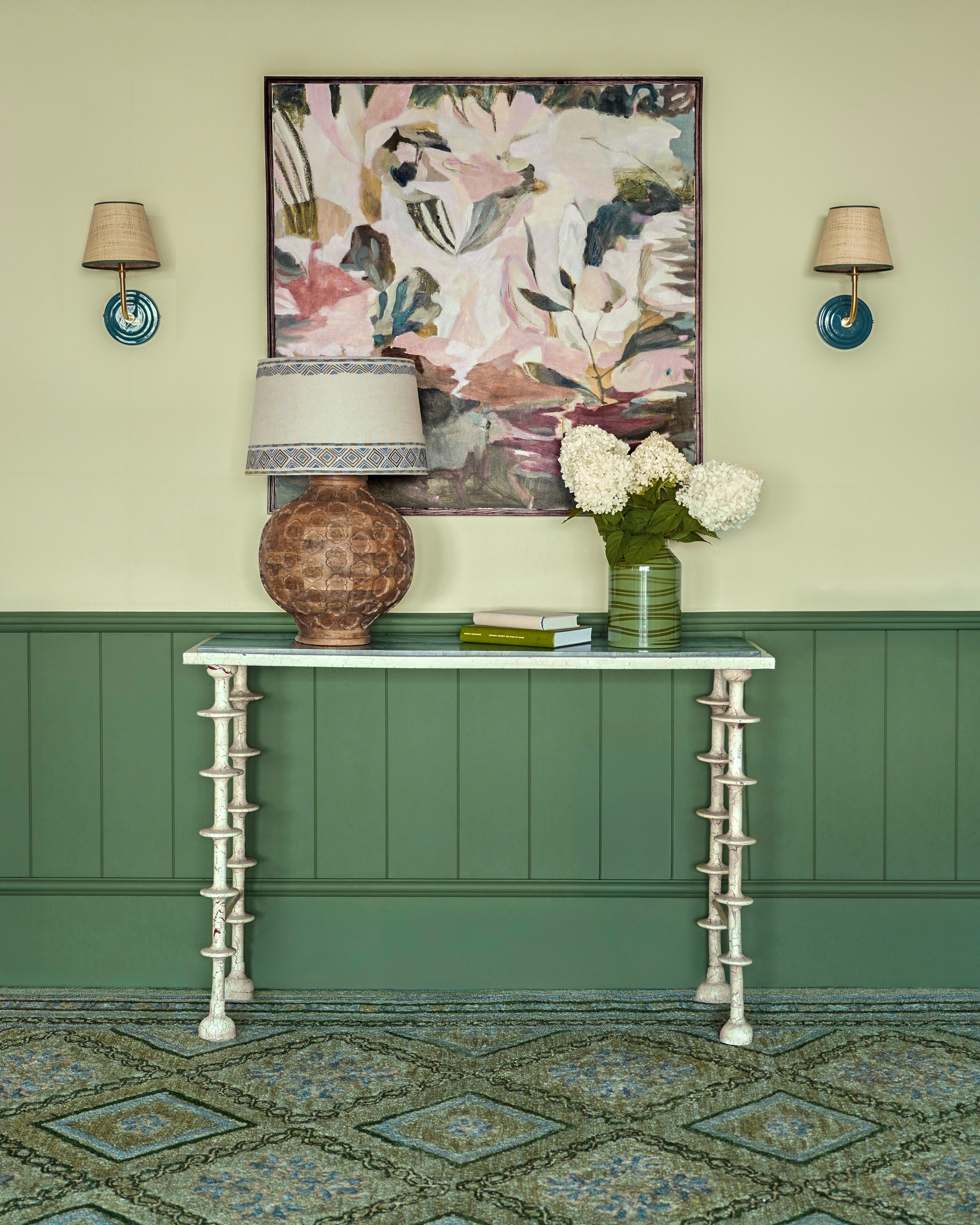
This is the perfect opportunity to go big on styling. White linens look lovely with a palette of greens or loads of different natural tones. So you could go with lots of greenery along the middle of the table (more is definitely more in this situation), clusters of candlesticks with green or white candles and glassware with lots of different textures. If you can find crockery with a hint of green then even better. The natural option works well with a slightly rustic feel. Think branches, pine cones, dried seed heads and wooden-handled cutlery like our Linear set.

 3. I want to do something a bit different, do you have any ideas?

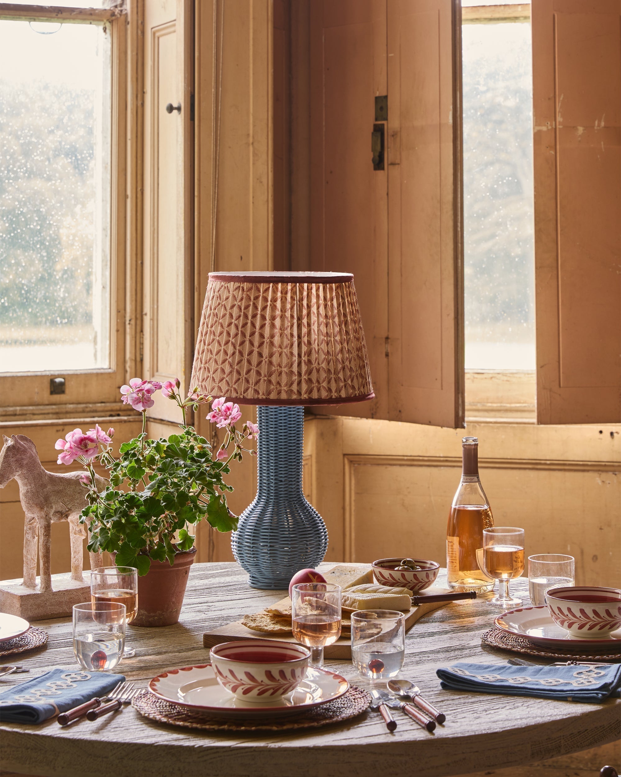
Green and red are obviously very traditional but how about a blue scheme? Blues against natural linen and soft arrangements of seasonal foliage can look wonderfully soft and sophisticated. Try a totally monochrome look with blue linens (like our Ilex and Bordered prints), blue painted crockery (our Bel plates and bowls are perfect for this) and blue decorations. Introduce a few subtle natural tones in any floral arrangements and place in blue vases or votives of different sizes and heights. We’ve just launched a new collection of our bestselling Beehive votives which come in handy sets of three, making them perfect for table styling. Blue candlesticks like our Rosie candlesticks with a mix of blue and white candles would complete the look.

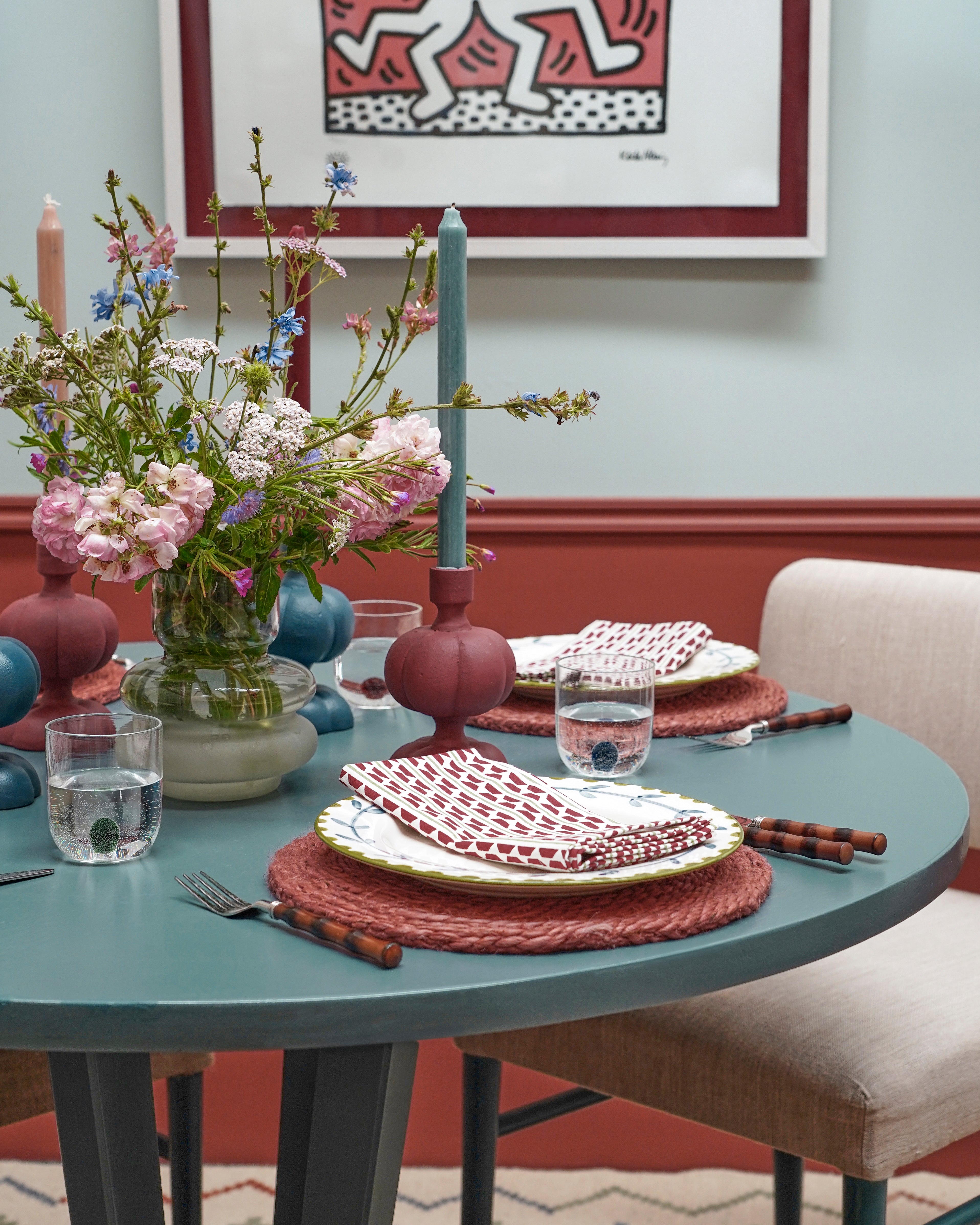
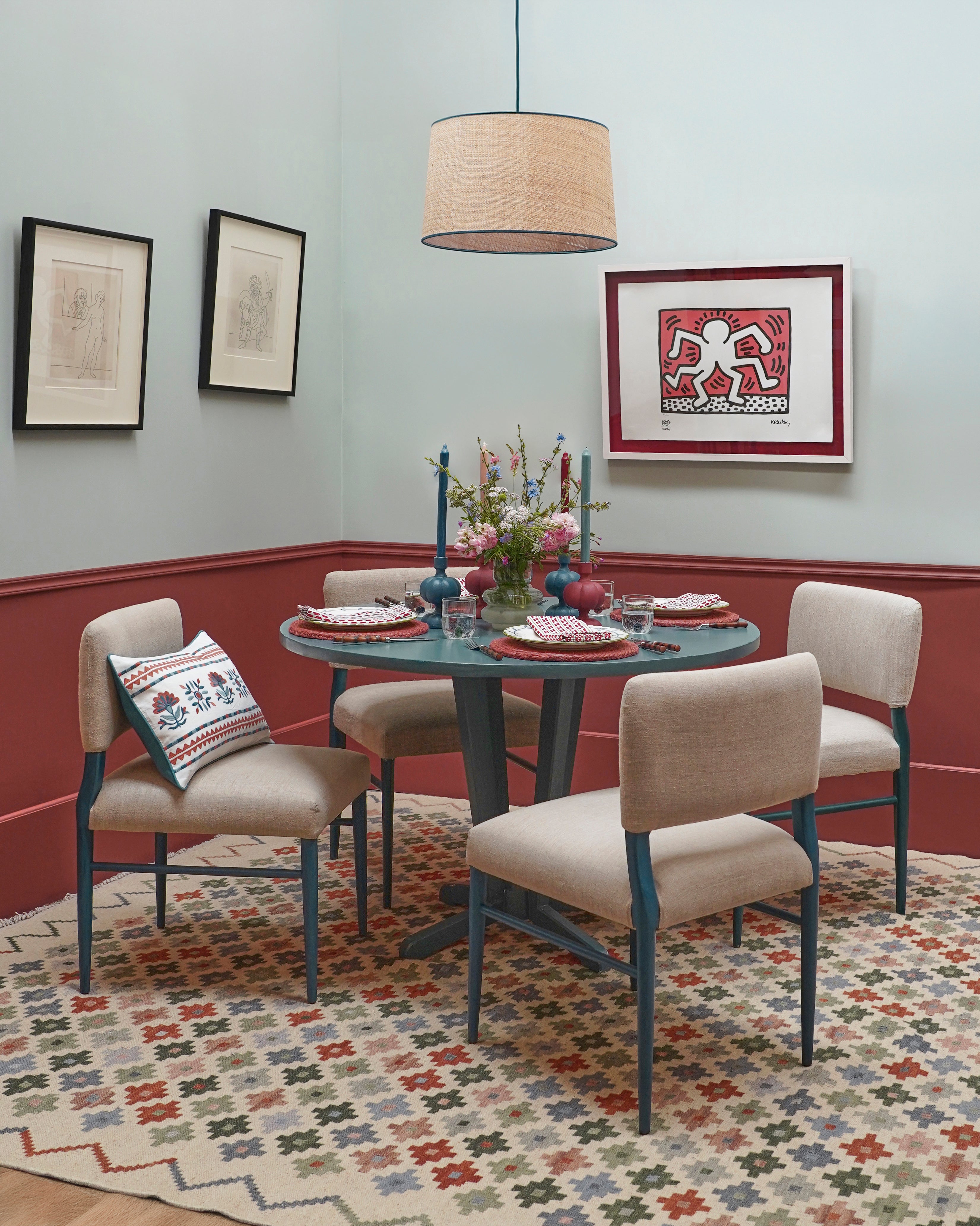
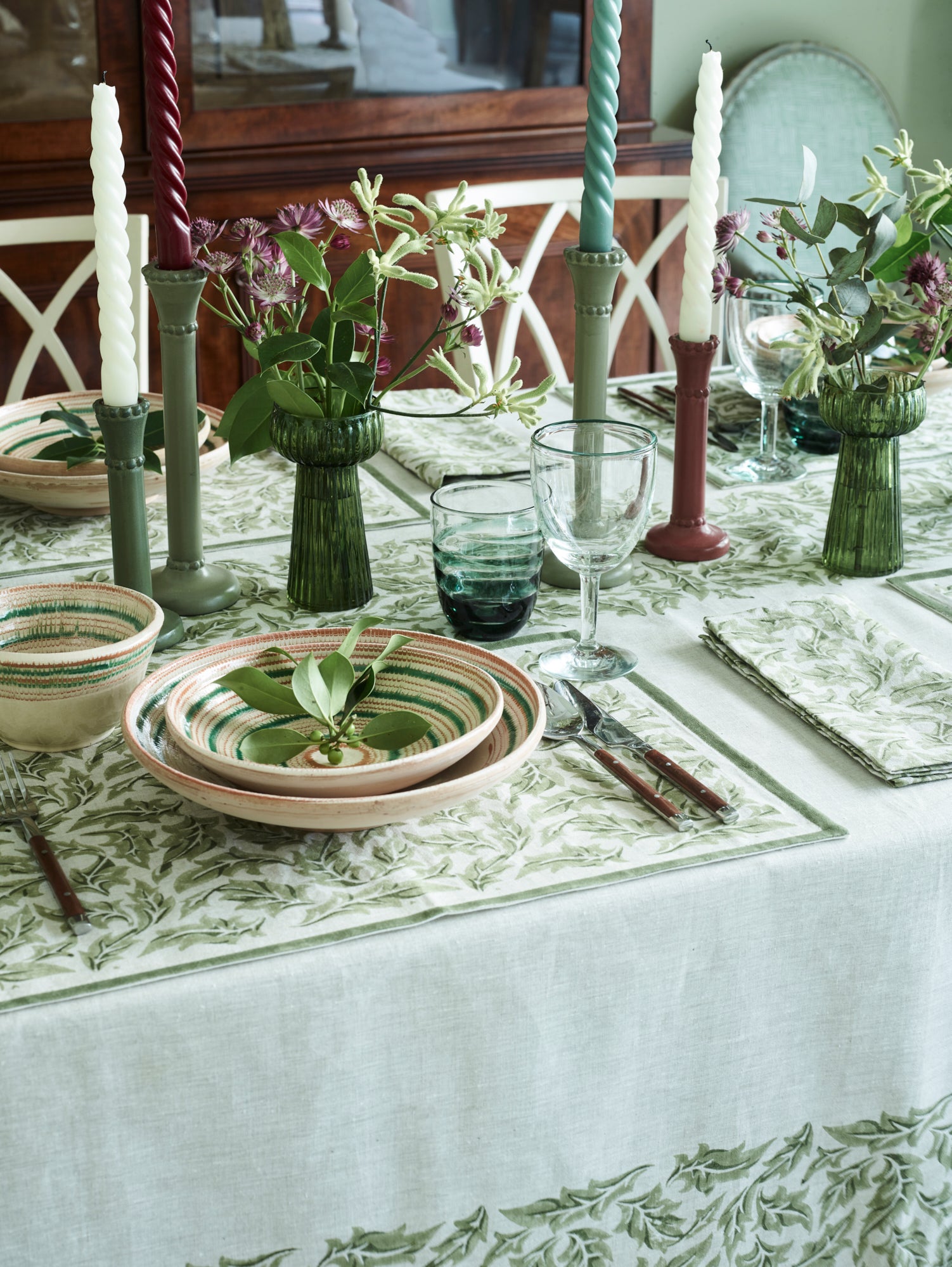
 4. Any ideas for good old green and red?

You can’t go wrong with green and red but how about softening the red to a gentle berry tone for an updated look? One of our favourite recent tables was created with a base of our Ilex printed linens in green, Linear wooden-handled cutlery and a mix of our fabulous Romanian bowls. These bowls are the key to tying the two colours together and mean that introducing pink Rosie candlesticks, deep berry candles and coordinating florals results in a completely harmonious scheme. 

Whether you are a dab hand with a brush or planning to get someone in, here are a few ideas of ways to enhance your space using our new paints.


Color swatches labeled with names from 'Birdie Fortescue' collection by Fenwick & Tilbrook.
Dining table setting with floral arrangement, candles, and plates in a room with a framed artwork on the wall.

Light and dark

Console table with decorative items against a green wall with floral artwork

This is a classic look for two reasons. Aesthetically speaking, splitting your wall into two distinct shades of light and dark – in this case, Nar above and Bure below – creates a sense of height and space in the room. The darker tone helps to ground the room while the brighter shade creates lightness and lifts the eye. From a practical perspective, the darker colour on the dado rail and wainscoting is also more forgiving for the wear and tear that our homes endure. It is also a very effective way to showcase paler coloured items of furniture like our Marble Top Crackle Console Table. We used our Coloured Wall Lights to link the lighter wall back to the rich tones of our Varuna Hand Tufted Trellis Wool Rug.

Handy hint: Rather than testing a paint colour directly on your walls, apply it to an A4-sized sheet of art card. That way you can audition the colour around your room and see how it changes with the light. You can also hold the painted card against your existing furnishings to test how they work together – and take the colour out with you when shopping for the room.

Beyond the pale

For those who think pale colours are a bit too safe or dull, please think again. For when used correctly they can create a wonderful space that is both warm and engaging. Here we have embraced the lightness, by using a combination of our Waveney paint above and Tud below. These hues provide a calm backdrop against which exquisite patterns like our Dumaloq Suzani can truly shine. The icing on the cake in this scheme is the sophisticated stripe of our Felipe Border pasted directly above the dado rail. Notice how it picks up on the accent colours within the Namda Felted Rug, and our Lattice Crewel Work Cushion.

Handy hint: Wallpaper borders are an easy way to create character and add a sense of structure to a plain room. If you are planning to paint a room just one colour, consider how a well-chosen border might add that extra something along your skirting boards and around the perimeter of your door frames.

Paper and paint

Here at Birdie HQ we love a patterned wallpaper but we also appreciate how four walls of it can feel a bit much. This is where a well-chosen paint comes into its own. For this scheme we combined the small-scale geometric tile pattern of our Sintra wallpaper with the deep calming

tones of our Wissey paint. The pair work wonderfully together creating a space that feels layered and considered. A bolder style such as this sits well with plainer pieces like our Abacus Floor Lamp and a treasured antique like this French 1970s Ulphostered Armchair, helping to bring out their sculptural qualities. Just a few judicious pops of pattern like our Crewel Work Cushion and the paintings of Lucy Innes Williams are all that is needed to complete the look.

Handy hint: When choosing your paint colours remember to consider how they will look against your flooring. For a more seamless look you may want to paint your walls and skirting boards the same colour. This works well in smaller spaces where you want to maximise the sense of space. However painting the skirting boards a different colour can be useful for balancing the transition from walls to floor – and adds an extra layer of interest to your scheme.

Gallery walls

Blue and red dining room with Fenwick and Tilbrook painted walls

If you own a very special piece of art, why not let it lead your paint scheme? Remember, you do not require clinically white walls to show pictures at their best. All you need is a sensitive eye and some thought as to what colours speak to you in the work and how they might translate into your room. This will ensure that your décor is complimenting not competing with your art. In our dining room, a rather splendid print by Keith Haring inspired our choice of Thurne for the richly painted dado and wainscoting, while we used Burn for the walls to allow the artwork space to breathe. Thurne’s bold red colour continues as an accent in the scheme from our Pumpkin Candlesticks and Ladder Stripe Napkins to our colourful Ziggurat Kilim Rug which provides a wonderful grounding for the space.

Handy hint: When your project is complete, be sure to transfer any small paint leftovers into a jam jar. This will come in very useful for touching up any future bumps or scrapes in the paintwork – and the paint will keep better as there is less air in the jar than the original tin. Should you find that you have a lot of paint left over, consider using it to paint the inside of a cupboard or an old piece of furniture that would appreciate the boost.

Neatly made bed with decorative pillows in a bedroom setting.

Which paint colour best suits my style?

Whether you’re drawn to soft, timeless neutrals or rich, characterful hues, our new paint collection has been carefully curated to bring warmth, depth, and individuality to your home. Each shade has been thoughtfully blended in collaboration with Fenwick and Tillbrook to harmonise beautifully with our furniture, lighting, and accessories - making it easy to create a cohesive and inspiring interior.

From grounding dark tones to uplifting pale shades, these paints offer endless possibilities to refresh and transform your home. Explore the collection today and discover the perfect colour to complement your style - available exclusively from Birdie Fortescue.

Related posts
Basket
Pair it with
Hello!
You’re visiting The Birdie Fortescue website from [[suggested_country]], would you like to shop the [[suggested_country]] site?