The Vasanti Collection has arrived + Free Shipping on Orders Over £400 - UK only
How to Style the Perfect Bedroom
Inspiration
How to Style the Perfect Bedroom
16th March 2022

How to Style the Perfect Bedroom

Is your bedroom looking a bit tired and unloved? Or maybe you have a guest room that hasn’t been touched for years and desperately needs some attention. Whatever the case may be read on for our top tips for creating a perfect bedroom. 

Green and White Wooden Bedroom

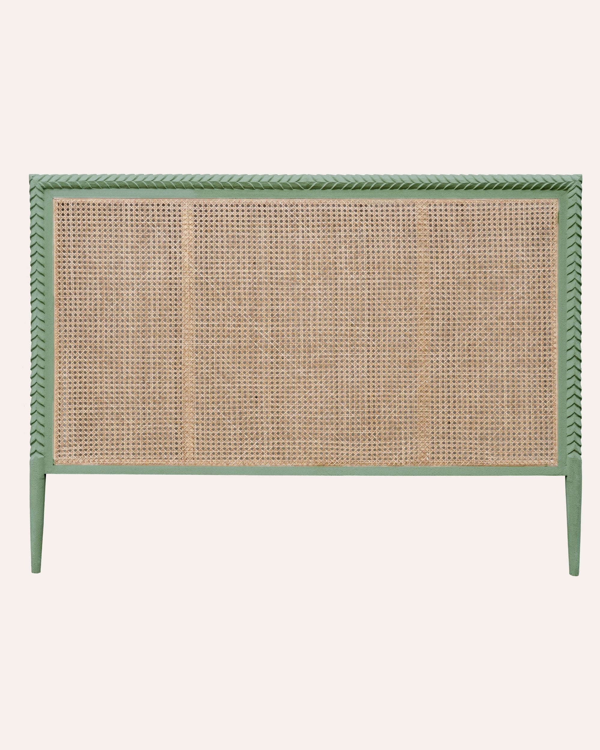
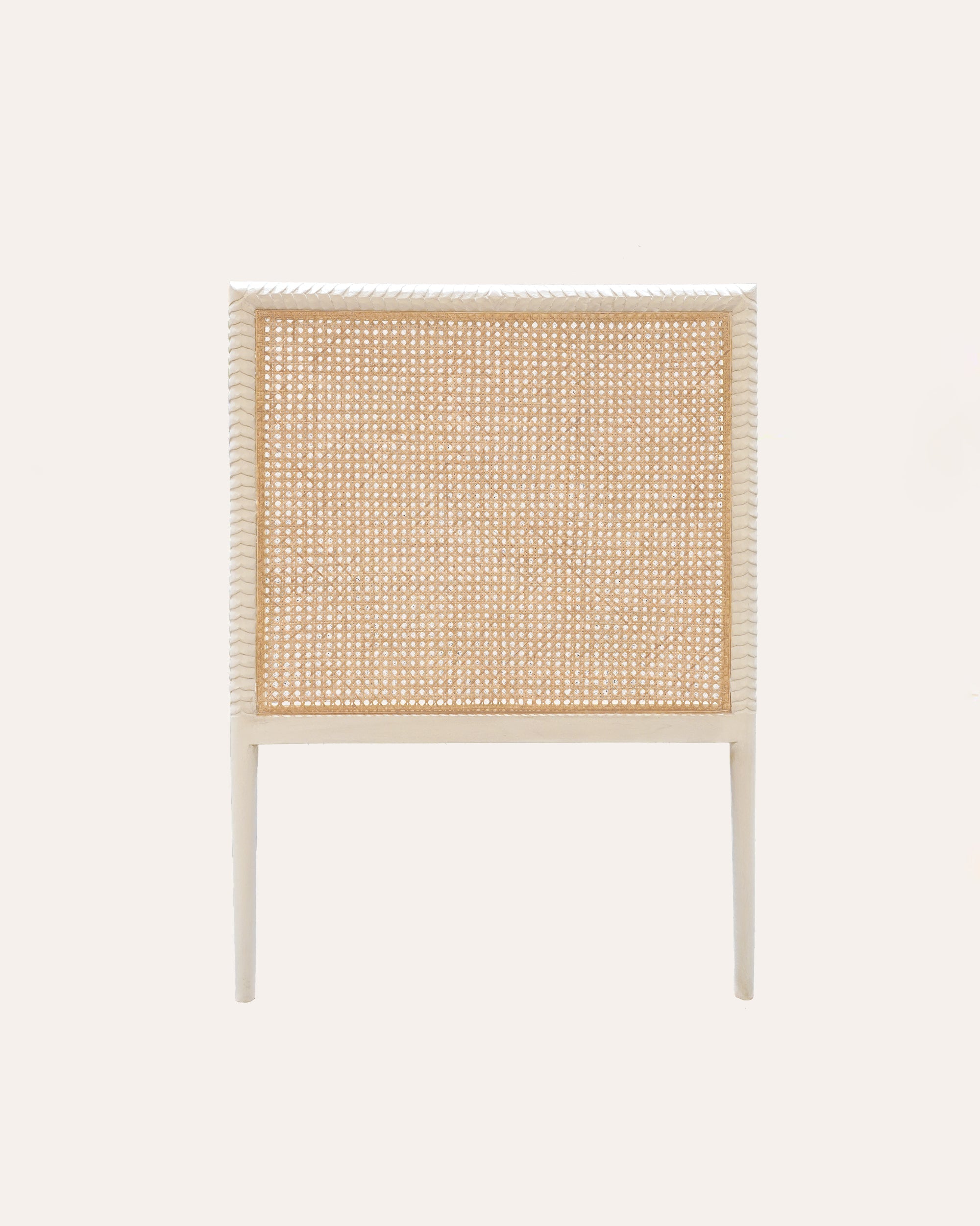
1 Perfect beds need perfect foundations 

Pink and Yellow Bedroom With Flower Paintings

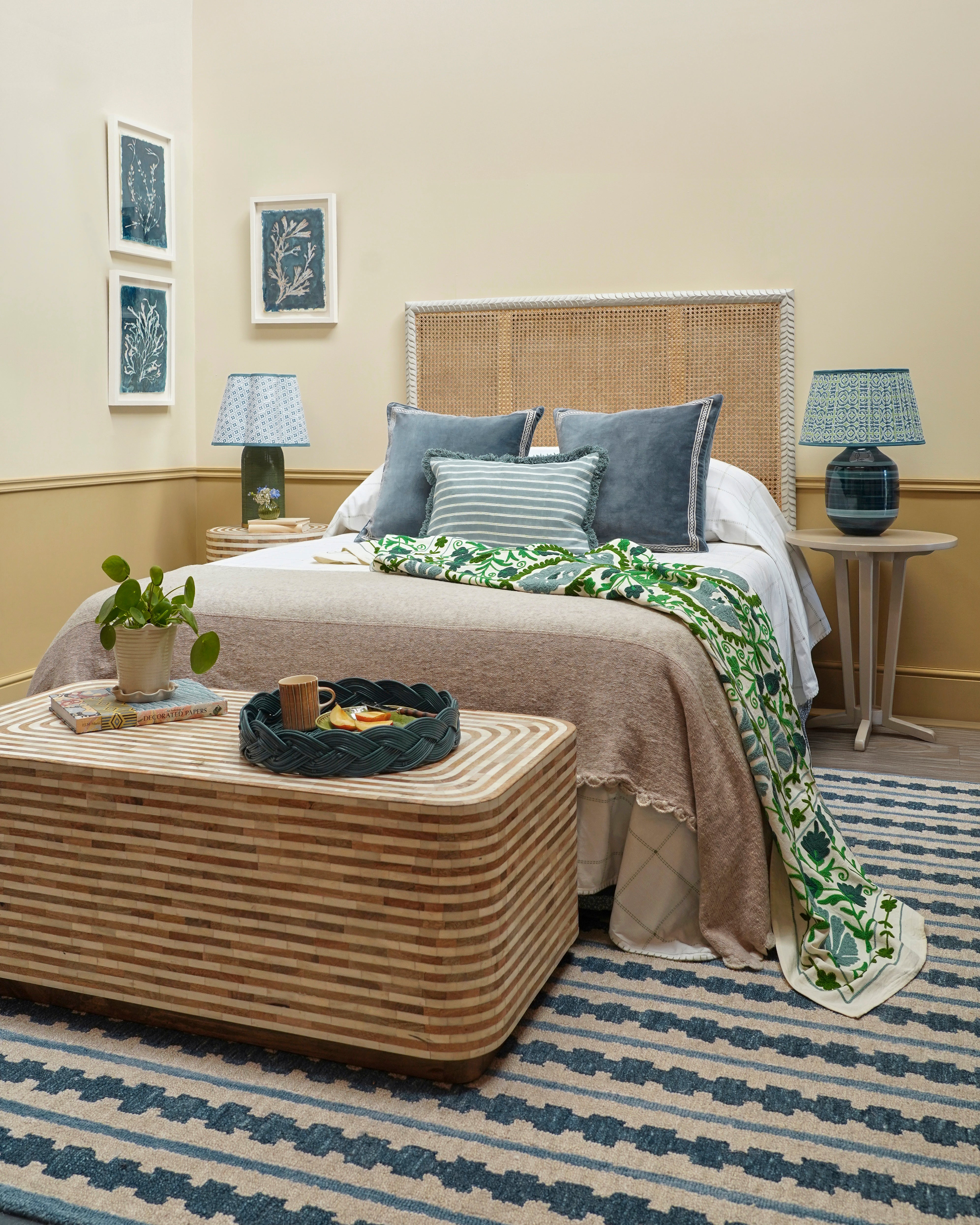
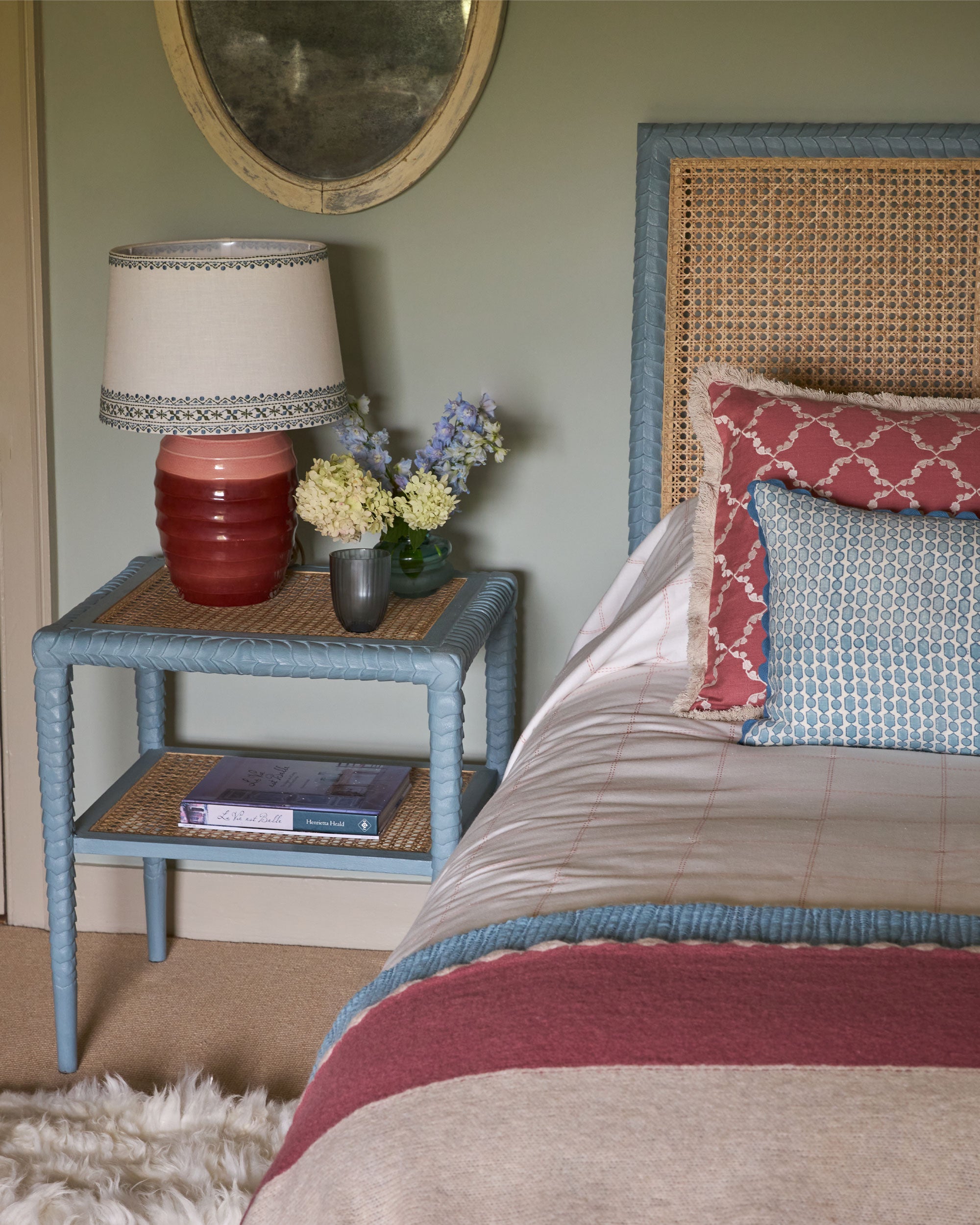
Have you ever looked at a picture of a bedroom in a magazine or on Instagram and wondered why the bed looks so amazing? The chances are that it has been made to within an inch of its life which takes a bit of time but is surprisingly easy with the right know how. The most important things to start with are good sheets - we always go for good quality white cotton and prefer pillowcases with Oxford edges. Before you go any further make sure you give everything a really good press. Crispness is key and worth taking a bit of extra time over as it makes a big difference to the finished result. Sometimes beds benefit from being made with hospital corners but it really depends on what will be visible once you’ve added throws and/or bedspreads. To create the best foundation for accessories make your bed with the pillows stacked on top of the duvet. This creates an even surface and a useful structure to lean cushions against. 

2 Choosing and using colours in a bedroom 

Blue twin attic bedroom

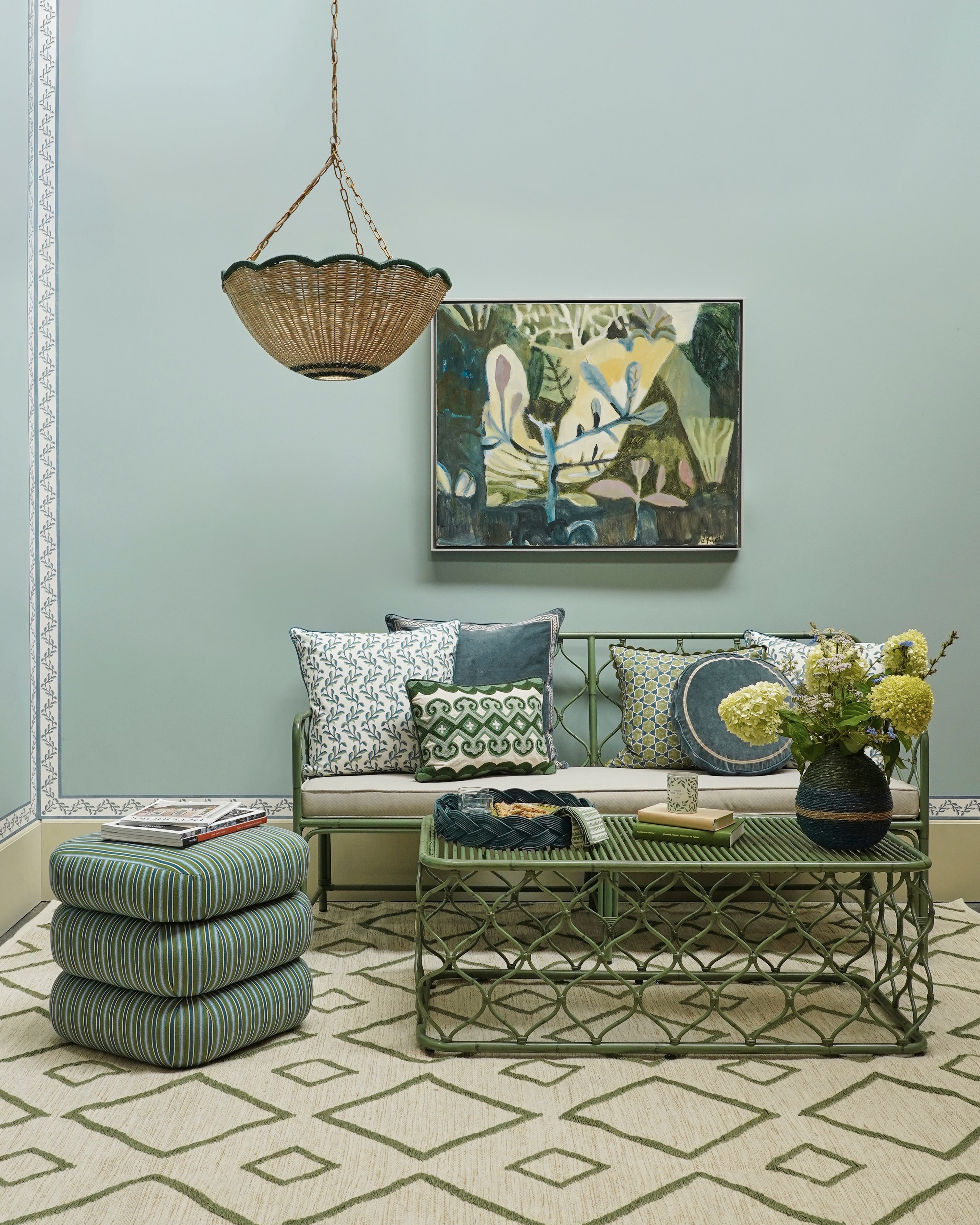
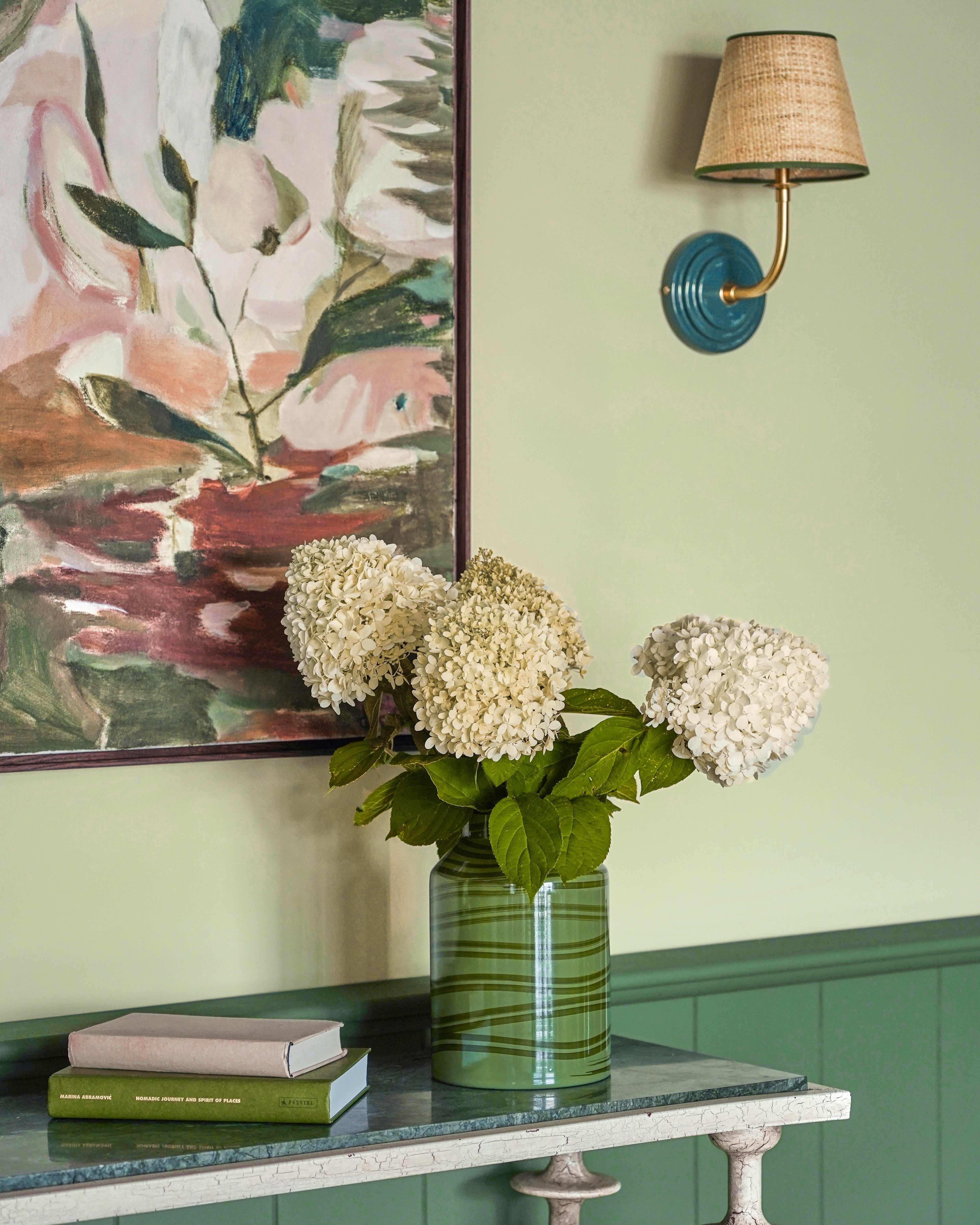
Most bedrooms benefit from a calm, restful feel but that does’t mean that there needs to be an absence of colour. The key to getting colour right in any scheme is to always aim for balance and harmony. This applies whether you’re using one colour or five - regularly take a step back as you put your room together and make sure that your combinations are harmonious. Basing your colour choices on a piece of art makes this process even easier and helps to create cohesion. We are big fans of monochrome schemes and they are particularly easy to put together. All you need to do is make sure that you split your single colour out into different tones and shades to use throughout the scheme. 

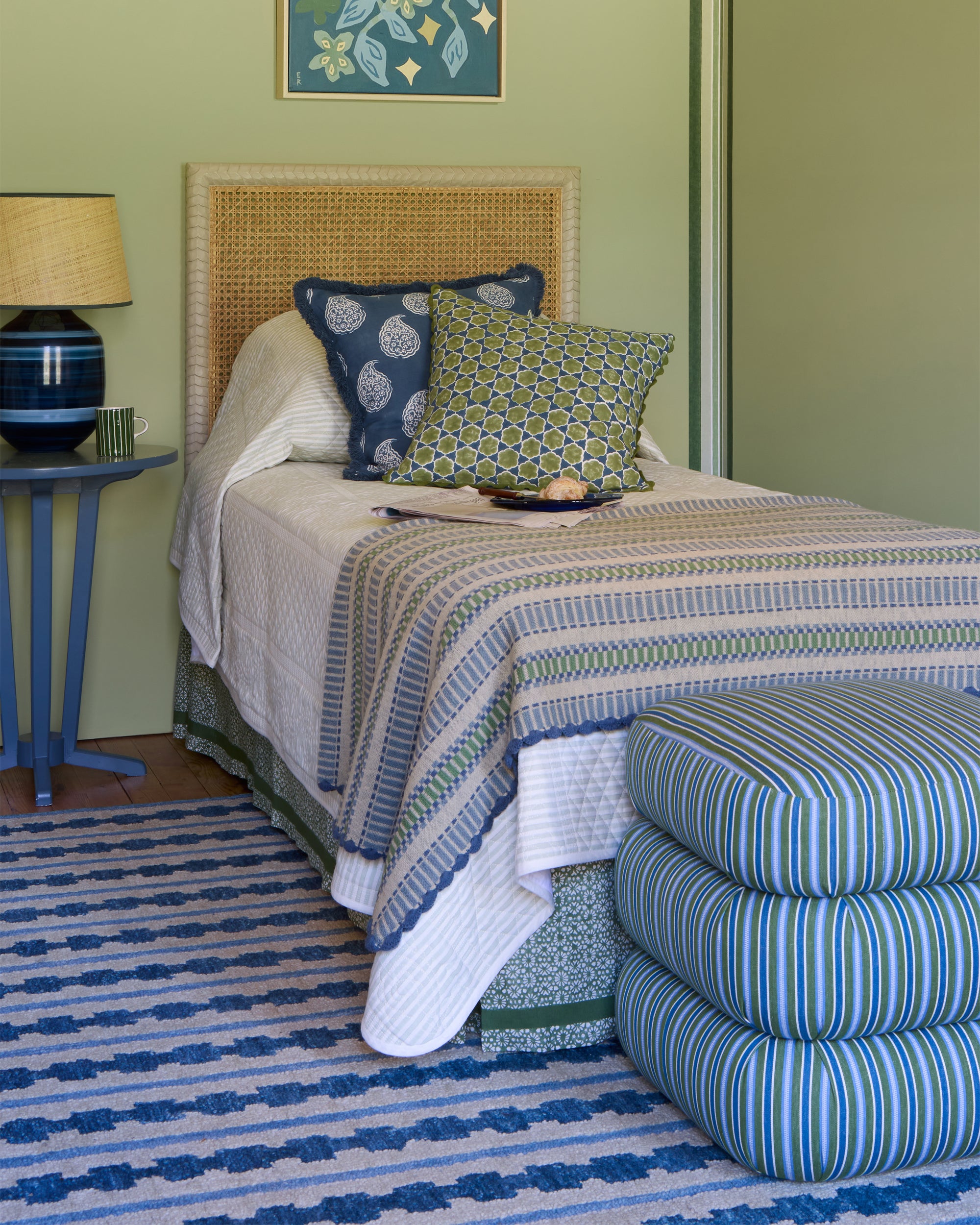
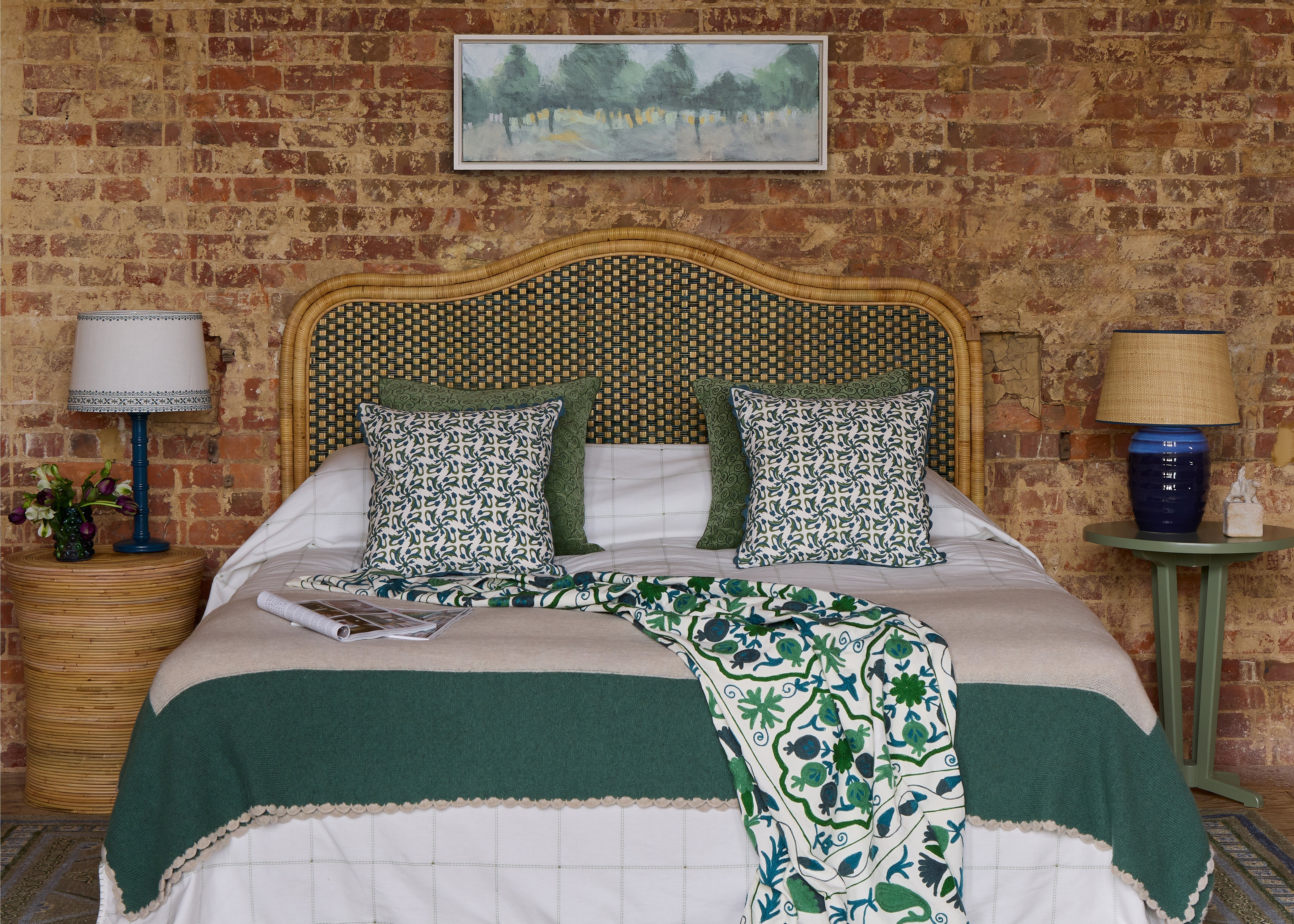
3 Bedspreads, throws, blankets and cushions 

Green and Blue Bedroom with Throw

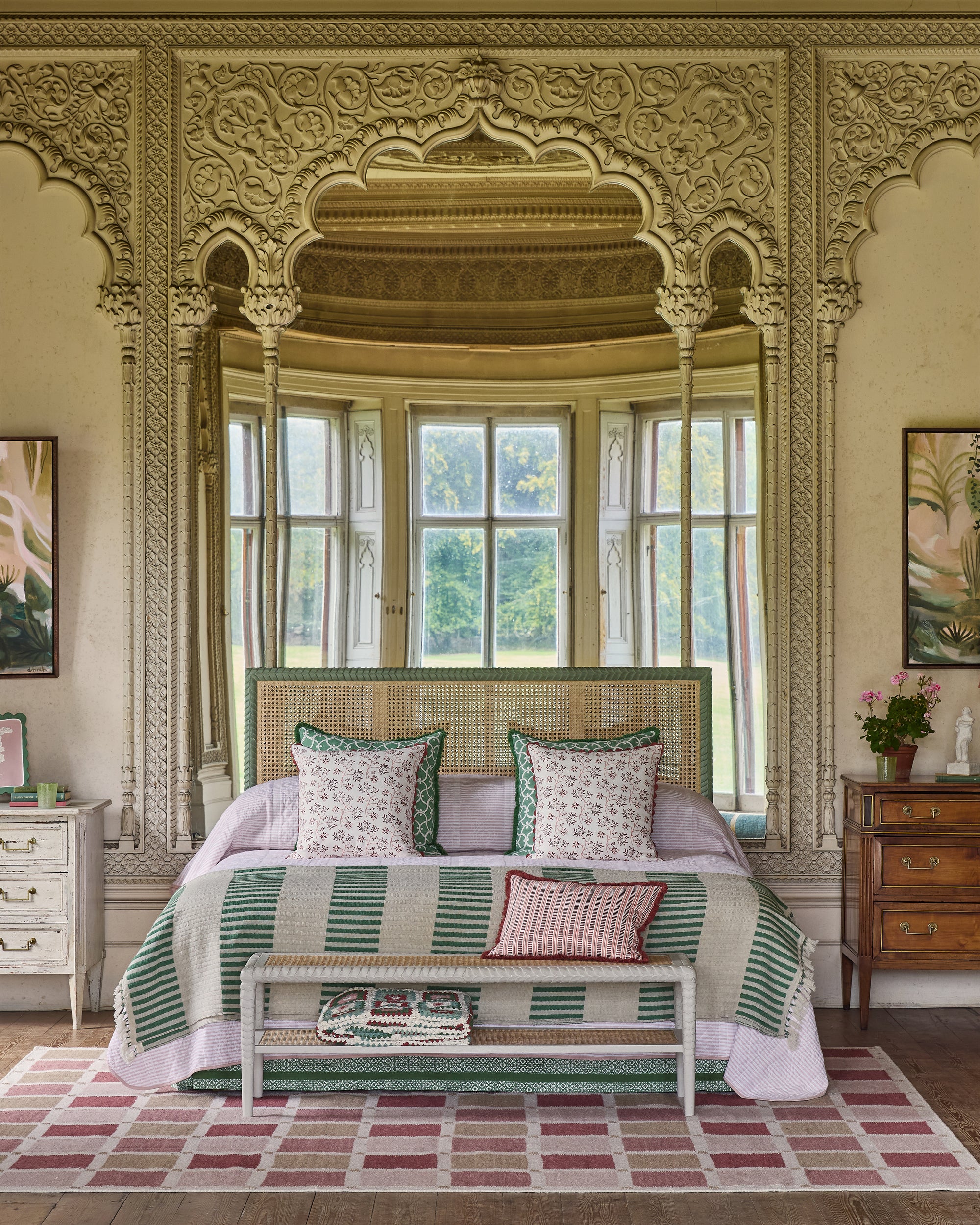
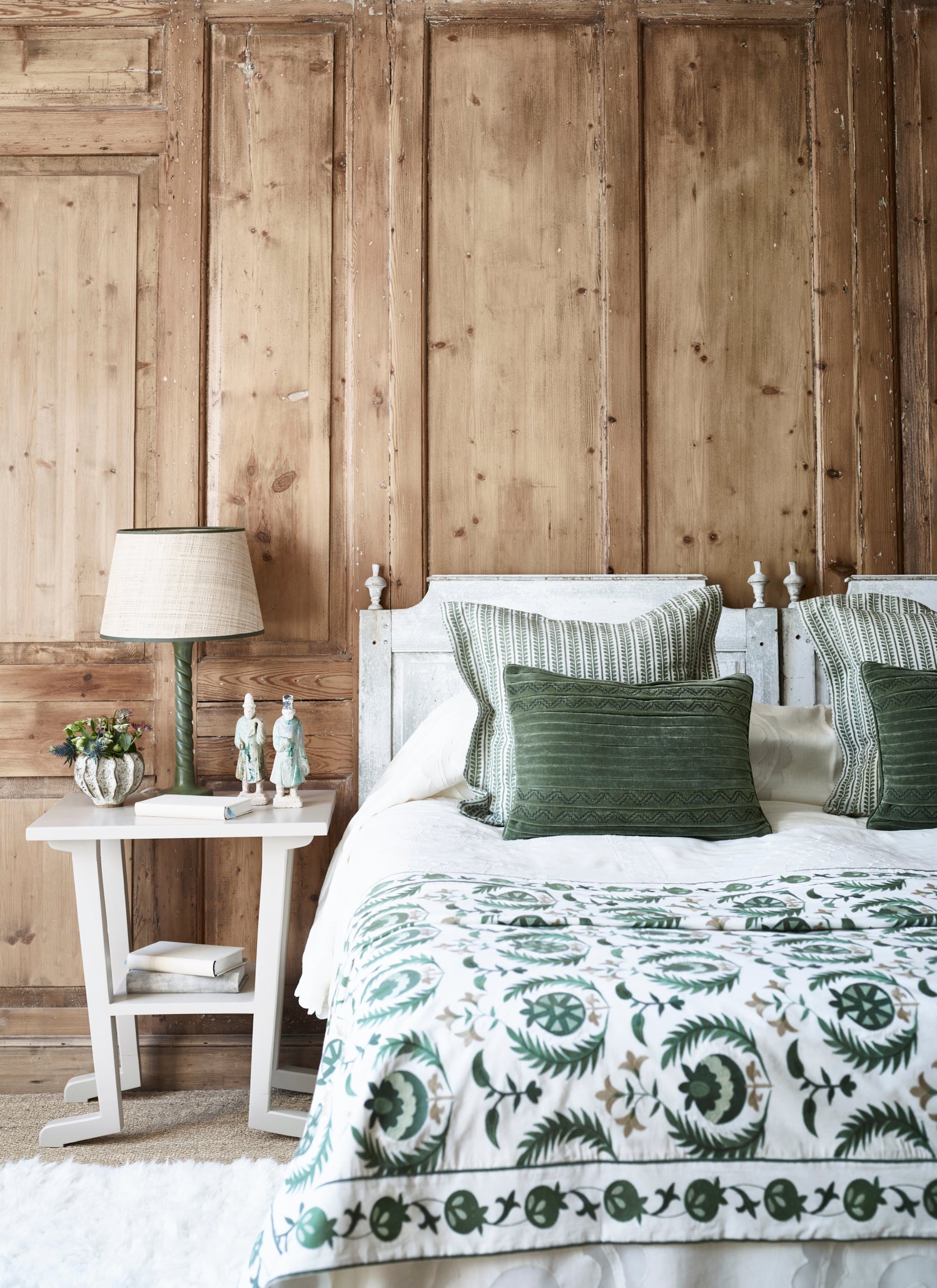
Fabrics are crucial in any room but they are particularly powerful in a bedroom setting. This scheme is deceptively simple with almost all of the visual interest and impact coming from the bedspreads, cushions and lampshades. To recreate this look at home choose two complimentary colours as your starting point. You could use tones from existing pieces in the room or you could base your colours around a piece of art like we’ve done here.

This bed is styled with two bedspreads - one with a textural design and just a little colour and the other with a much bolder pattern in stronger tones. Aim for similar layering and make sure your strongest colour is on top. Doubling up bedspreads is an easy way to make beds look more luxurious and is also handy if your linens aren’t great and need to be hidden!

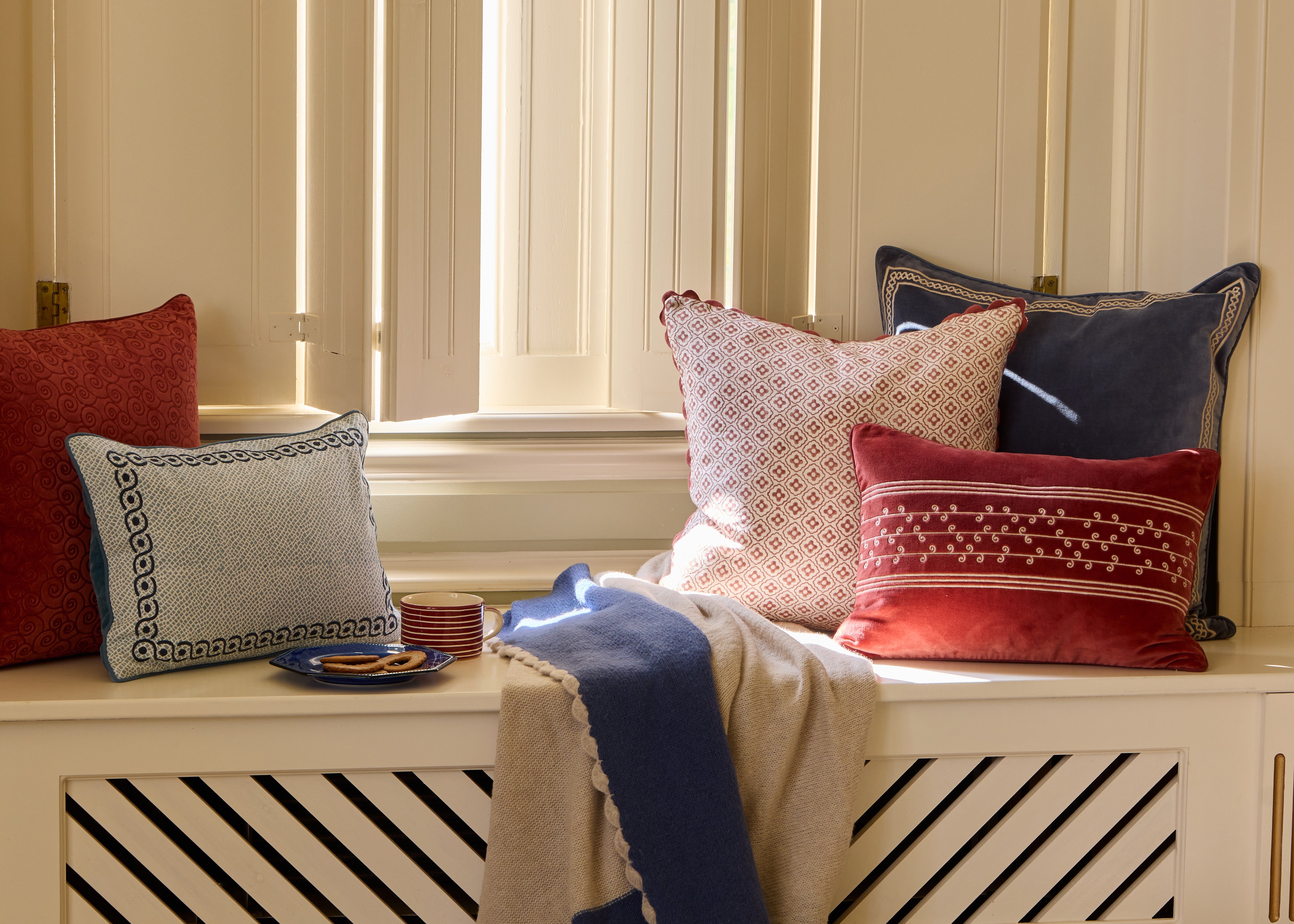
The next step is to choose two pairs of matching cushions. The most important thing is to use your strongest colour at the back and then the softer tone in front. This bed is styled with plain velvets at the back and a print on the front but mixing prints and plains also works well. The overarching theme here is botanical but we have carefully interpreted it so that no one design overpowers the other. Using a mixture of small scale, trailing and highly stylised prints prevents the theme from dominating yet provides just enough of a thread to tie the scheme together.

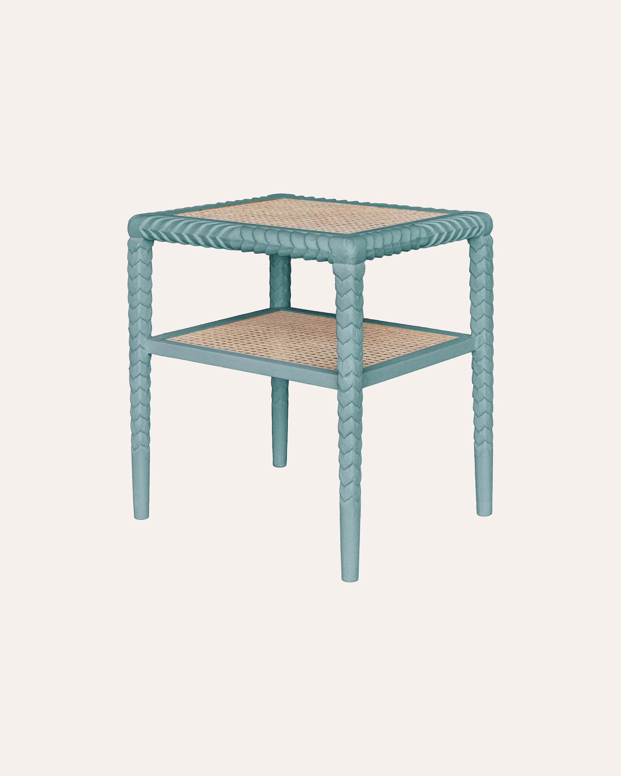
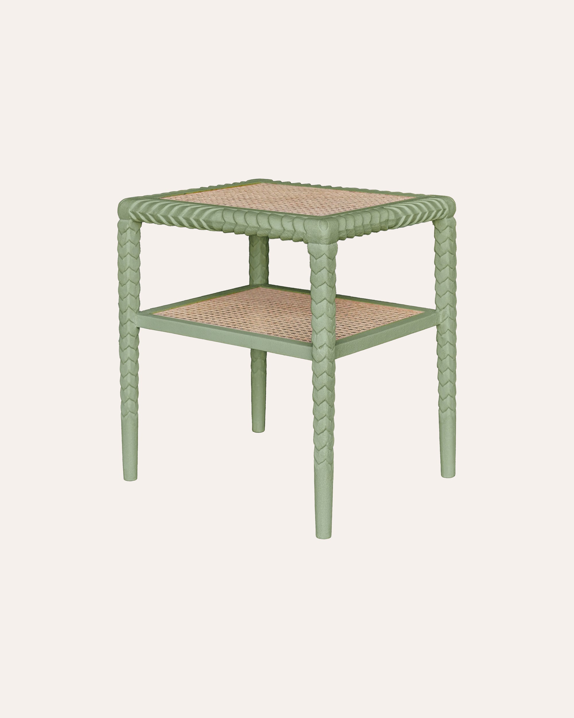
4 Bedside lamps for bedrooms

Red and Blue Bedroom Close Up - Striped Embroidered Cushion Detail

Lighting is really important in a bedroom and bedside lamps are crucial for different reasons. Not only is the right lamp vital for reading but it also helps to frame the bed and provides structure in the scheme. More often than not matching lamps are the go-to but sometimes a non-matching pair can work well. If you decide to give different lamps a go then don’t forget to consider the proportions of each lamp and how they relate to the space. It may be that a taller base would work on one side of the bed but not the other or perhaps a certain shape of lamp reflects the subject of a painting. Whatever the case may be the goal is always balance and harmony.

If you’ve got some great lamp bases to use but need to freshen up your shades then remember this handy rule of thumb: The base diameter of your shade should be roughly the same as the height of your base. This rule is a very useful starting point but bear in mind that the huge variety of base shapes and sizes means that it’s not always infallible!

5 Finishing Touches

Pink and Green Bedroom Furniture Pieces With Fireplace and Lamp

Bedroom Fireplace Styling Focus

Thoughtfully chosen decorative accessories give a bedroom an inviting, homely feel. These final touches are particularly important in guest bedrooms which have a tendency to feel a little cold as they wouldn’t normally be filled with personal ephemera and family pieces. Inject personality into your guest rooms by adding items that delight your guests. These pieces could be carefully selected books and magazines, vases filled with garden flowers, warm throws for chilly evenings or interesting sculptures.

We like to always place a vase of flowers beside the bed and often on a commode or dressing table too. Books can also be used for visual impact - a collection of vintage puffin books or bold coffee table tomes all look great on shelves, tables or even chairs.

If you’re lucky enough to have a fireplace in your guest room then don’t forget to pay attention to the mantelpiece. This is a great spot for a sculpture or small collection of decorative pieces.

Whether you are a dab hand with a brush or planning to get someone in, here are a few ideas of ways to enhance your space using our new paints.


Color swatches labeled with names from 'Birdie Fortescue' collection by Fenwick & Tilbrook.
Dining table setting with floral arrangement, candles, and plates in a room with a framed artwork on the wall.

Light and dark

Console table with decorative items against a green wall with floral artwork

This is a classic look for two reasons. Aesthetically speaking, splitting your wall into two distinct shades of light and dark – in this case, Nar above and Bure below – creates a sense of height and space in the room. The darker tone helps to ground the room while the brighter shade creates lightness and lifts the eye. From a practical perspective, the darker colour on the dado rail and wainscoting is also more forgiving for the wear and tear that our homes endure. It is also a very effective way to showcase paler coloured items of furniture like our Marble Top Crackle Console Table. We used our Coloured Wall Lights to link the lighter wall back to the rich tones of our Varuna Hand Tufted Trellis Wool Rug.

Handy hint: Rather than testing a paint colour directly on your walls, apply it to an A4-sized sheet of art card. That way you can audition the colour around your room and see how it changes with the light. You can also hold the painted card against your existing furnishings to test how they work together – and take the colour out with you when shopping for the room.

Beyond the pale

For those who think pale colours are a bit too safe or dull, please think again. For when used correctly they can create a wonderful space that is both warm and engaging. Here we have embraced the lightness, by using a combination of our Waveney paint above and Tud below. These hues provide a calm backdrop against which exquisite patterns like our Dumaloq Suzani can truly shine. The icing on the cake in this scheme is the sophisticated stripe of our Felipe Border pasted directly above the dado rail. Notice how it picks up on the accent colours within the Namda Felted Rug, and our Lattice Crewel Work Cushion.

Handy hint: Wallpaper borders are an easy way to create character and add a sense of structure to a plain room. If you are planning to paint a room just one colour, consider how a well-chosen border might add that extra something along your skirting boards and around the perimeter of your door frames.

Paper and paint

Here at Birdie HQ we love a patterned wallpaper but we also appreciate how four walls of it can feel a bit much. This is where a well-chosen paint comes into its own. For this scheme we combined the small-scale geometric tile pattern of our Sintra wallpaper with the deep calming

tones of our Wissey paint. The pair work wonderfully together creating a space that feels layered and considered. A bolder style such as this sits well with plainer pieces like our Abacus Floor Lamp and a treasured antique like this French 1970s Ulphostered Armchair, helping to bring out their sculptural qualities. Just a few judicious pops of pattern like our Crewel Work Cushion and the paintings of Lucy Innes Williams are all that is needed to complete the look.

Handy hint: When choosing your paint colours remember to consider how they will look against your flooring. For a more seamless look you may want to paint your walls and skirting boards the same colour. This works well in smaller spaces where you want to maximise the sense of space. However painting the skirting boards a different colour can be useful for balancing the transition from walls to floor – and adds an extra layer of interest to your scheme.

Gallery walls

Blue and red dining room with Fenwick and Tilbrook painted walls

If you own a very special piece of art, why not let it lead your paint scheme? Remember, you do not require clinically white walls to show pictures at their best. All you need is a sensitive eye and some thought as to what colours speak to you in the work and how they might translate into your room. This will ensure that your décor is complimenting not competing with your art. In our dining room, a rather splendid print by Keith Haring inspired our choice of Thurne for the richly painted dado and wainscoting, while we used Burn for the walls to allow the artwork space to breathe. Thurne’s bold red colour continues as an accent in the scheme from our Pumpkin Candlesticks and Ladder Stripe Napkins to our colourful Ziggurat Kilim Rug which provides a wonderful grounding for the space.

Handy hint: When your project is complete, be sure to transfer any small paint leftovers into a jam jar. This will come in very useful for touching up any future bumps or scrapes in the paintwork – and the paint will keep better as there is less air in the jar than the original tin. Should you find that you have a lot of paint left over, consider using it to paint the inside of a cupboard or an old piece of furniture that would appreciate the boost.

Neatly made bed with decorative pillows in a bedroom setting.

Which paint colour best suits my style?

Whether you’re drawn to soft, timeless neutrals or rich, characterful hues, our new paint collection has been carefully curated to bring warmth, depth, and individuality to your home. Each shade has been thoughtfully blended in collaboration with Fenwick and Tillbrook to harmonise beautifully with our furniture, lighting, and accessories - making it easy to create a cohesive and inspiring interior.

From grounding dark tones to uplifting pale shades, these paints offer endless possibilities to refresh and transform your home. Explore the collection today and discover the perfect colour to complement your style - available exclusively from Birdie Fortescue.

Related posts
Basket
Pair it with
Hello!
You’re visiting The Birdie Fortescue website from [[suggested_country]], would you like to shop the [[suggested_country]] site?